The Ultimate Guide on Working with Excel charts in C#
Charts have the power to convey data graphically, so the viewers can understand at a glance what you are trying to say in so many rows and columns. That's why generating charts in reports is recommended.
To generate excel charts in a C# or VB.NET project, you can rely on GemBox.Spreadsheet. This powerful library enables you to programmatically read, write, and do all kinds of calculations and data manipulation.
In this guide, you will see all the supported chart types and learn how to create, edit, and do other advanced tasks using the GemBox.Spreadsheet component in C# and VB.NET.
You can browse through the sections below to completely understand how to use Charts with the help of GemBox.Spreadsheet:
- Install and configure the GemBox.Spreadsheet library
- Chart types and their specifics
- How to create and format a chart in an XLSX file
- How to Load an XLSX chart and modify its data
- How to Export a scatter chart to PDF
- How to create a complex stacked bar chart
- How to create a chart sheet with an associated pie chart
- Preservation of unsupported chart features
- Creating charts in DOCX and PPTX
Install and configure the GemBox.Spreadsheet library
For this article, we propose that you create a new .NET project. If you are unfamiliar with Visual Studio or need a reminder, refer to the official tutorial. Also, although GemBox.Spreadsheet supports a wide range of .NET versions (from .NET Framework 4.6.2) we recommend that you use the newest version.
Before you can start creating and manipulating charts, you need to install GemBox.Spreadsheet. The best way to do that is via NuGet Package Manager.
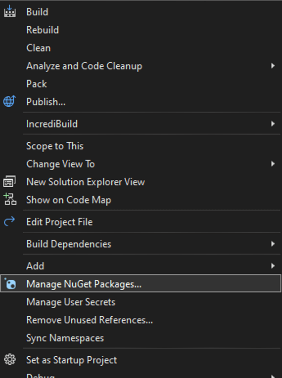
- In the Solution Explorer window, right-click on the solution and select 'Manage NuGet Packages for Solution'.
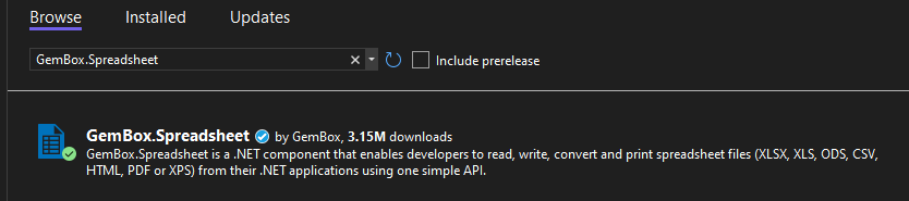
- Search for GemBox.Spreadsheet and click on 'Install'.
Alternatively, you can open the NuGet Package Manager Console (Tools -> NuGet Package Manager -> Package Manager Console) and run the following command:
Install-Package GemBox.Spreadsheet
Now that you have installed the GemBox.Spreadsheet library, all you have to do is make sure you call the SpreadsheetInfo.SetLicense method before using any other member of the library. Since we are working with a console application, we suggest putting it at the beginning of the Main() method.
If you have set everything correctly, your code should look like this:
using GemBox.Spreadsheet;
class Program
{
    static void Main()
    {
        SpreadsheetInfo.SetLicense("FREE-LIMITED-KEY");

        // The code starts here

    }
}
In this tutorial, we are going to work in the free mode. The free mode allows you to use the library without purchasing the license, but with limitations. You can read more about working modes and limitations on the Evaluation and Licensing page.
Chart types and their specifics
GemBox.Spreadsheet supports the following Microsoft Excel chart types:
Let's go through all of their specifics and best use cases.
Line chart

In this type of chart, a line connects several distinct data points. Line charts are mainly used to view trends in data, usually over time.
For example, to see the sales volume in 3 years, setting each month's value in rows, you can easily see if there are specific periods of the year in which the product sells more.
Area chart

An area chart is a line chart, but the space between the x-axis and the line is filled with a color or pattern.
It helps you analyze both overall and individual trend information.
Bar chart

Bar charts show the data in horizontal rectangular bars with lengths directly proportional to the values they represent.
One of the best uses for this chart type is to compare different categories of data or even reveal highs and lows in a performance at a glance.
Column chart

A column chart uses vertical rectangular bars to compare different data or even the same data over time.
For example, you can use this format to see the number of customers that visit your site daily in a week, setting each column as a day of the week with the respective number of visitors.
Pie chart

Pie charts are represented by a circle divided into slices. The size of each slice is proportional to the quantity it represents. This format is ideal for working out a composition of something specific.
So, a good example of a use case for a pie chart would be displaying the percentage of answers from a poll made in the company.
Doughnut chart

Doughnut charts are represented by a circle divided into slices with and optional hole in the center. Like pie chart the size of each slice is proportional to the quantity it represents. It can show multiple slice groups together for comparison and better visual. This format is ideal for working out a composition of something specific.
So, a good example of a use case for a doughnut chart would be displaying the percentage of revenue from different sources and different years to show the changes over the years.
Scatter chart

A scatter chart consists of dots to represent values for two different numeric variables. The position of each dot on the horizontal and vertical axis will indicate values for an individual data point.
It is the best chart type to display data if you are looking for outliers in the total sales in a year.
Radar chart

A radar chart displays multivariate data of three or more quantitative variables starting from the center point. It is especially useful for displaying data that are not directly comparable.
A good example of a use case for a radar chart would be comparing the skill matrix for two or more employees.
Combo chart

A combo chart in Excel displays two chart types on the same chart. For example, you can use a column chart plus a line chart, one showing the number of sales in a year and the other showing advertising expenses, with both information in months so that they will coincide in the graphical representation.
How to create and format a chart in an XLSX file
This example shows how you can create an XLSX file with a line chart using C#. This specific code will display a worksheet with the volume of a company's sales in 2021.
First, you need to create a new workbook with a 'Sales' worksheet.
var workbook = new ExcelFile();
var worksheet = workbook.Worksheets.Add("Sales");
Next, you need to add the data that the Excel chart will use. Set the content of each row of the first column to the months' names.
worksheet.Cells["A1"].Value = "Month";
worksheet.Cells["A2"].Value = "January";
worksheet.Cells["A3"].Value = "February";
worksheet.Cells["A4"].Value = "March";
worksheet.Cells["A5"].Value = "April";
worksheet.Cells["A6"].Value = "May";
worksheet.Cells["A7"].Value = "June";
worksheet.Cells["A8"].Value = "July";
worksheet.Cells["A9"].Value = "August";
worksheet.Cells["A10"].Value = "September";
worksheet.Cells["A11"].Value = "October";
worksheet.Cells["A12"].Value = "November";
worksheet.Cells["A13"].Value = "December";
Now fill in the values of sales for each month by setting the value of each row of the second column.
worksheet.Cells["B1"].Value = "Sales";
worksheet.Cells["B2"].Value = 2500;
worksheet.Cells["B3"].Value = 2500;
worksheet.Cells["B4"].Value = 2000;
worksheet.Cells["B5"].Value = 1500;
worksheet.Cells["B6"].Value = 1500;
worksheet.Cells["B7"].Value = 2000;
worksheet.Cells["B8"].Value = 2000;
worksheet.Cells["B9"].Value = 1500;
worksheet.Cells["B10"].Value = 1500;
worksheet.Cells["B11"].Value = 2000;
worksheet.Cells["B12"].Value = 2500;
worksheet.Cells["B13"].Value = 2500;
Create an ExcelChart and select data for it. Here you will add a LineChart, defining the range the line will follow, as well as the range of the data.
var data = worksheet.Cells.GetSubrange("A1", "B13");
var chart = worksheet.Charts.Add<LineChart>("D1", "P20");
chart.SelectData(data, true);
Define all the colors in the chart according to your preferences. In the following code, you will use them to customize the background, the graph line, the text, and the border.
var white = DrawingColor.FromName(DrawingColorName.White);
var darkBlue = DrawingColor.FromHsl(218, 100, 30);
var lightBlue = DrawingColor.FromRgb(0, 171, 221);
After that, you will format the chart, fill it with the background color, and set the specifications for the outline with the information given in the last code snippet.
chart.Fill.SetSolid(white);
chart.Outline.Width = Length.From(1, LengthUnit.Point);
chart.Outline.Fill.SetSolid(darkBlue);
chart.Title.TextFormat.Fill.SetSolid(darkBlue);
Format the plot area the same way you did with the chart in the previous step, specifying the ChartPlotArea class.
chart.PlotArea.Outline.Width = Length.From(1, LengthUnit.Point);
chart.PlotArea.Outline.Fill.SetSolid(white);
Next, start formatting the axes, both vertical and horizontal. Here you will set the text color and format.
chart.Axes.Vertical.TextFormat.Fill.SetSolid(darkBlue);
chart.Axes.Vertical.TextFormat.Italic = true;

chart.Axes.Horizontal.TextFormat.Fill.SetSolid(darkBlue);
chart.Axes.Horizontal.TextFormat.Size = Length.From(12, LengthUnit.Point);
chart.Axes.Horizontal.TextFormat.Bold = true;
Set the width of the vertical major gridlines.
chart.Axes.Vertical.MajorGridlines.Outline.Width = Length.From(0.5, LengthUnit.Point); Format the ChartSeries, setting an outline width and fill.
var series = chart.Series[0];
series.Outline.Width = Length.From(3, LengthUnit.Point);
series.Outline.Fill.SetSolid(lightBlue);
The last formatting you will set is the series markers. Set the MarkerType to 'circle'. Also, set the size, the marker fill color, and the outline fill color.
series.Marker.MarkerType = MarkerType.Circle;
series.Marker.Size = 6;
series.Marker.Fill.SetSolid(darkBlue);
series.Marker.Outline.Fill.SetSolid(darkBlue);
Last, save your workbook containing the chart, and you are all done.
workbook.Save("Company X Sales.xlsx"); } }After executing the previous code, your Excel file with the line chart will look like the screenshot below:

How to load an XLSX chart and modify its data
With GemBox.Spreadsheet, you can also load a chart and edit its existing data. In this example, you will select the workbook you created in the previous section, 'Company X Sales.xlsx'.
var workbook = ExcelFile.Load("Company X Sales.xlsx");
var worksheet = workbook.Worksheets["Sales"];
Now you will select which existing data you want to modify.
var december = worksheet.Cells["B13"];
december.Value = december.IntValue + 500;
worksheet.Cells["B1"].Value = "Sales 2020";
And also add more data, which you will use to create a new line on the chart.
worksheet.Cells["C1"].Value = "Sales 2021";
worksheet.Cells["C3"].Value = 3000;
worksheet.Cells["C4"].Value = 3500;
worksheet.Cells["C2"].Value = 3000;
worksheet.Cells["C5"].Value = 3000;
worksheet.Cells["C6"].Value = 4500;
worksheet.Cells["C7"].Value = 4500;
worksheet.Cells["C8"].Value = 5000;
worksheet.Cells["C9"].Value = 4500;
worksheet.Cells["C10"].Value = 4000;
worksheet.Cells["C11"].Value = 4500;
worksheet.Cells["C12"].Value = 4500;
worksheet.Cells["C13"].Value = 5000;
The next step is to update the chart. You start by retrieving it and updating its data to include the new column, then you can also change other aspects like its position and title.
var chart = worksheet.Charts.Get<LineChart>(0);
chart.SelectData(worksheet.Cells.GetSubrange("A1", "C13"), true);
chart.Position.From = new AnchorCell(worksheet.Cells["E1"], true);
chart.Title.Text = "Sales 2020/2021";
The last step is to customize the appearance of the new line:
var darkOrange = DrawingColor.FromRgb(121, 50, 17);
var lightOrange = DrawingColor.FromRgb(242, 101, 34);

var series = chart.Series[1];
series.Outline.Width = Length.From(3, LengthUnit.Point);
series.Outline.Fill.SetSolid(lightOrange);

series.Marker.MarkerType = MarkerType.Circle;
series.Marker.Size = 6;
series.Marker.Fill.SetSolid(darkOrange);
series.Marker.Outline.Fill.SetSolid(darkOrange);
Finally, you can save the workbook with the changes you made. You can save it with the same name or choose a different one to keep both versions, as shown below:
workbook.Save("Updated Company X Sales.xlsx");You can refer to the following image, to see the result of executing the code above.

How to Export a scatter chart to PDF
If you need to convert your Excel charts to another format, such as PDF, you can also do this with GemBox.Spreadsheet.
To begin, you need to load the Excel file you want to export.
var workbook = ExcelFile.Load("Scatter Chart.xlsx");Since the default value for PrintOptions.SelectionType is ActiveSheet, you must select the Excel sheet you want to export and set it as active.That way, the output will contain only the selected worksheet when exporting Excel to PDF.
var worksheet = workbook.Worksheets[0]
workbook.Worksheets.ActiveWorksheet = worksheet;
Now specify the cell range you want to export and set the targeted range as the print area.
var range = worksheet.Cells.GetSubrange("A5:I14");
worksheet.NamedRanges.SetPrintArea(range);
Last, save the workbook as a PDF file by setting the final format as '.pdf'.
workbook.Save("Convert.pdf");How to create a complex stacked bar chart
Now, let's explore how to create more complex charts, such as a stacked bar chart. In this section, you will learn how to create a chart that shows a company's revenue for each year.
Start by creating an ExcelFile with a worksheet called 'Revenue'.
var workbook = new ExcelFile();
var worksheet = workbook.Worksheets.Add("Revenue");
Then create a bar chart and select the data it will represent.
var chart = worksheet.Charts.Add<BarChart>(Chart grouping.Stacked, "A1", "I14");
chart.SelectData(worksheet.Cells.GetSubrange("A15", "F18"), true);
Start filling the data with revenues for each of the products.
worksheet.Cells["A15"].Value = "Years";
worksheet.Cells["A16"].Value = "2018";
worksheet.Cells["A17"].Value = "2020";
worksheet.Cells["A18"].Value = "2021";

worksheet.Cells["B15"].Value = "Product A";
worksheet.Cells["B16"].Value = 25000;
worksheet.Cells["B17"].Value = 25000;
worksheet.Cells["B18"].Value = 30000;

worksheet.Cells["C15"].Value = "Product B";
worksheet.Cells["C16"].Value = 20000;
worksheet.Cells["C17"].Value = 20000;
worksheet.Cells["C18"].Value = 30000;

worksheet.Cells["D15"].Value = "Product C";
worksheet.Cells["D16"].Value = 30000;
worksheet.Cells["D17"].Value = 35000;
worksheet.Cells["D18"].Value = 30000;

worksheet.Cells["E15"].Value = "Product D";
worksheet.Cells["E16"].Value = 35000;
worksheet.Cells["E17"].Value = 30000;
worksheet.Cells["E18"].Value = 35000;

worksheet.Cells["F15"].Value = "Product E";
worksheet.Cells["F16"].Value = 30000;
worksheet.Cells["F17"].Value = 40000;
worksheet.Cells["F18"].Value = 40000;
You can also set a column width to ensure that the values will be readable.
worksheet.Columns["A"].SetWidth(3, LengthUnit.Centimeter);
worksheet.Columns["B"].SetWidth(3, LengthUnit.Centimeter);
worksheet.Columns["C"].SetWidth(3, LengthUnit.Centimeter);
worksheet.Columns["D"].SetWidth(3, LengthUnit.Centimeter);
worksheet.Columns["E"].SetWidth(3, LengthUnit.Centimeter);
worksheet.Columns["F"].SetWidth(3, LengthUnit.Centimeter);
Now you set the chart title and its style by setting the font to "Arial Black" size 14, and making it bold.
chart.Title.Text = "Revenue by year and product";
chart.Title.IsVisible = true;
chart.Title.TextFormat.Font = "Arial Black";
chart.Title.TextFormat.Size = 14;
chart.Title.TextFormat.Bold = true;
For this chart, you will also set the space between each series to 0.4.
chart.SeriesGapWidth = 0.4;The next step is to set a chart legend, its position, font format, and borders.
chart.Legend.IsVisible = true;
chart.Legend.Position = ChartLegendPosition.Top;
chart.Legend.TextFormat.Font = "Arial";
chart.Legend.TextFormat.Size = 10;
chart.Legend.Outline.Width = Length.From(0.75, LengthUnit.Point);
chart.Legend.Outline.Fill.SetSolid(DrawingColor.FromRgb(217, 217, 217));
After that, you need to change the axis titles of the bar graph, setting each one using the chart.Axes property. The vertical axis will be called 'Year', with font 'Arial' size 11:
chart.Axes.Vertical.Title.Text = "Year";
chart.Axes.Vertical.Title.TextFormat.Size = 11;
chart.Axes.Vertical.Title.TextFormat.Font = "Arial";
The horizontal axis will be 'Revenue', with font 'Arial' size 11, horizontal text direction and custom formatting that will transform values like '100,000' into '100K':
chart.Axes.Horizontal.Title.Text = "Revenue";
chart.Axes.Horizontal.Title.TextFormat.Size = 11;
chart.Axes.Horizontal.Title.TextFormat.Font = "Arial";
chart.Axes.Horizontal.Title.Direction = ChartTitleDirection.Horizontal;
chart.Axes.Horizontal.NumberFormat = "#,##0, K";
The final step will be to show the chart's data labels, so that the value of each year/product will be drawn inside the corresponding bar stack, with currency formatting.
chart.DataLabels.Show();
chart.DataLabels.LabelPosition = DataLabelPosition.Center;
chart.DataLabels.NumberFormat = NumberFormatBuilder.Currency("$", 2, true);
And then you can finally save the workbook as an xlsx file:
workbook.Save("Revenue by year and product.xlsx");The following image shows the complex stacked bar resulting from the code above.

How to create a chart sheet with a pie chart on it
The pie chart is the best type to use if you need to highlight percentages. Since pie charts don't have axes, you will need a different approach than in the other examples in this article.
To create a pie chart from scratch, you need to do the following:
Create a workbook and the worksheet you want to work on. In this code, you will create a workbook for marketing campaign results.
var workbook = new ExcelFile();
var worksheet = workbook.Worksheets.Add("Data");
Then you will add data to the worksheet, which the Excel chart will use. This worksheet will display data on ad conversions through social media, with the sources 'Facebook', 'TikTok', 'Instagram', and 'LinkedIn':
worksheet.Cells["A1"].Value = "Channel";
worksheet.Cells["A2"].Value = "Instagram";
worksheet.Cells["A3"].Value = "Facebook";
worksheet.Cells["A4"].Value = "TikTok";
worksheet.Cells["A5"].Value = "LinkedIn";
worksheet.Cells["B1"].Value = "Conversion";
worksheet.Cells["B2"].Value = 360;
worksheet.Cells["B3"].Value = 220;
worksheet.Cells["B4"].Value = 524;
worksheet.Cells["B5"].Value = 40;
Next, you need to set the header row and the formatting. In this case, you will change the header row's font to bold, the columns' width, and the number format.
worksheet.Rows[0].Style.Font.Weight = ExcelFont.BoldWeight;
worksheet.Columns[0].SetWidth(3, LengthUnit.Centimeter);
worksheet.Columns[1].Style.NumberFormat = "\"$\"#,##0";
It's necessary to set the entire sheet to print on a single page.
worksheet.PrintOptions.FitWorksheetWidthToPages = 1;
worksheet.PrintOptions.FitWorksheetHeightToPages = 1;
Create an Excel chart sheet and add the Pie chart to it. You will also choose data for it. You can't set the size of the chart area when it is located on a chart sheet, as it will snap to the maximum size on the chart sheet.
var chartsheet = workbook.Worksheets.Add(SheetType.Chart, "Chart");
var chart = chartsheet.Charts.Add(ChartType.Pie, 0, 0, 0, 0, LengthUnit.Centimeter);
chart.SelectData(worksheet.Cells.GetSubrangeAbsolute(0, 0, 4, 1), true);
Finally, set the chart sheet as active and save the workbook as an XLSX file.
workbook.Worksheets.ActiveWorksheet = chartsheet;
workbook.Save("PieChart.xlsx");
After running the code, the generated pie chart file should look like in the image below.

Preservation of unsupported chart features
GemBox.Spreadsheet does not support some Excel chart types like 3D charts, bubble, or gantt. However, it will preserve them, so they will still be contained in the output XLSX file.
Note that preserved charts can reflect changes made to data when opened in the MS Excel application.
One way to accomplish this is to use named ranges as a data source for charts. That way, you can modify the chart's data by changing it in those ranges or changing the named ranges themselves.
For more information about chart preservation, see the Charts Preservation section help page.
Creating charts in DOCX and PPTX
GemBox.Document and GemBox.Presentation are components that also support charts but without GemBox.Spreadsheet, they will only preserve them.
When using GemBox.Spreadsheet, the other two components allow you to create and update charts in DOCX and PPTX documents. You can also export files with graphs to PDF, XPS, or image formats.
For more information refer to the GemBox.Document or GemBox.Presentation chart examples.
Conclusion
With this guide, you have learned all the steps to create, export, and edit different types of Excel charts in C# and VB.NET using the GemBox.Spreadsheet library.
Now you can easily display the data in your worksheets visually to help improve your Excel projects.
For more information regarding the GemBox.Spreadsheet API, you can take a moment to read the documentation pages and browse through our examples with executable code sections.
If you have any questions regarding the examples, refer to our forum page or submit a ticket to our technical support.